


Maithili Doshi is a graphic designer and has an experience of over a decade in the world of book-publishing. Apart from designing book covers at Speaking Tiger Books as their Art Director, she has also created some exemplary and intriguing book covers for publishing houses like Rupa Publications and HarperCollins Publishers.
I want to start by posing an overarching question as a book cover designer:
How did you come to become a book cover designer? What was the journey like? How essential is a reading habit to being a good cover artist?
Maithili Doshi: I am originally from Bombay and when I graduated, the only place for design/applied arts students was advertising agencies. Design studios were quite niche and publishing was not much heard of as a full-time career option. But I was not much inclined towards advertising and worked in design studios for ten years on branding and packaging projects.
In 2009, I moved to Delhi. With the new city I was keen on exploring something new as a designer too. I was always fascinated by book covers but never had a chance to design any. Delhi seemed to be the place to explore this side of design. So I applied for a job as a designer at Penguin Books. I had never designed a book cover before that. But soon realised that as long as I understood the subject, I just needed to apply all my previous learnings from a poster design to branding. In the end, it’s all about communicating with your audience, in this case the reader. Thus began my journey as a book cover designer.
While my peers in advertising and design studios thought this was just a short stint, I continued as I loved what I was doing. It was refreshing. From Penguin I moved to Rupa Publication as the Art Director. It was the time they were rebranding themselves and it was a challenging time to be there, as I was not just designing a new language for their books but also setting up a lot of design processes.
For the last five years I have been with Speaking Tiger Books doing all things design from the art directing the covers as well as designing them. After three publishing houses and about ten years I still enjoy what I do.
I think it’s very important for a designer to read. If not the entire book at least a few chapters. Sometimes one might not have the appetite to read the book as it’s not their kind of genre. But reading always helps to set the mood which is very important. It dictates the kind of visual, illustrations or photographs and even the kind of typography you would use. Unless you read, the cover may not stay true to the writing and it would turn out to be more superficial.
At what stage does cover designing come in? How closely do you work with the author in the process?
Maithili Doshi: I would say that there is no set formula in cover design, and I think that is what makes it enjoyable. Each book and each subject is different. It involves different creative people from the author, the editor and in case you are collaborating with an illustrator or typographer that too.
Depending on the book, the process of designing a cover can start from the time the editor starts the first edit or sometime much later too, as it depends a lot on them too. But cover is always an integral part of the process. At times the editors start talking about a project that they are ideating/ commissioning and that can be good enough stimulus for a designer to keep thinking at the back of their mind.
To be honest, it’s been only very few times that I have directly interacted with the authors. Though the authors always communicate their ideas and it is always the starting point. It is very important to know what the author is thinking, as eventually, we are translating the author’s thoughts into a visual, which becomes the first impression of their work.
But having said that, as a designer it is our interpretation of these ideas that can make or break the cover.
We need to be sensible enough to take in just the right amount and build on it. And eventually when an author writes to you saying how the cover has achieved what they envisioned, it’s satisfying.
Almost a few years after I designed a cover, the author of the book wrote to me that, the new cover I designed was splendid and encapsulating the book perfectly and that he was very happy about it. This is one of the covers I personally love as well. We had never spoken or communicated over e-mail before I designed the cover or till recently.
But I did read the extracts from the book, and had discussions with the editor. (This was from Chetan Raj Shreshta for the new cover I did for Light of His Clan, illustrated by Priya Sebastian). For me that’s a fruitful collaboration. As much as the author, the editor’s understanding and translating the book’s crux is also a key factor. I have been lucky to have worked with wonderful editors and publishers who have given me space to design and mostly had a clear vision for their books.
Covers become symbolic of an author’s work – as in the case of Easterine Kire. Have you designed all or more than one of her covers? How do you keep that consistency? What are the thoughts in choosing what to keep and what to not?
Maithili Doshi: Like I said the book cover is the face of the book and it not only represents the book but the author too. It’s like the branding for the book and the author, where you are creating an image for them. It could be planned or developed oraganically.
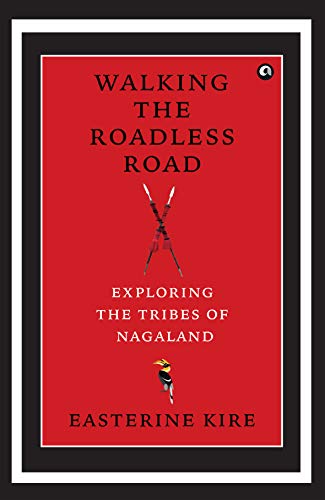
In the case of Easterine Kire*, I designed all the covers for her books that are with Speaking Tiger Books. The first cover I did for Son of the Thundercloud did not work really well. It was too abstract and didn’t communicate enough. So when we decided to re-do the cover, I read the book once again. Also by that time I had read Don’t Run, My Love too. There was a similar feel to the stories, apart from their setting. They almost seemed part folk, part magical and intriguing. I really love these two books.


So I decided to collaborate with illustrator Kavita Singh Kale, whose style is very spontaneous, with some amount of rawness in a good sense. We planned to continue with the clouds as an element for both the covers which are common to both the stories. The clouds are drawn in a distinctive manner which ties the covers together. The typography used for both the books is the same. And then we followed a similar approach to Sky Is My Father. But while this was done, each book has its own identity.
It’s very important to not get carried away trying to establish consistency as the books tell different stories and that has to come across too.
How much to retain and how much to change, one needs to get that balance right. Sometimes it could just be the way the typography is used or only a particular illustration style. Everything else can be flexible to bring out the content.
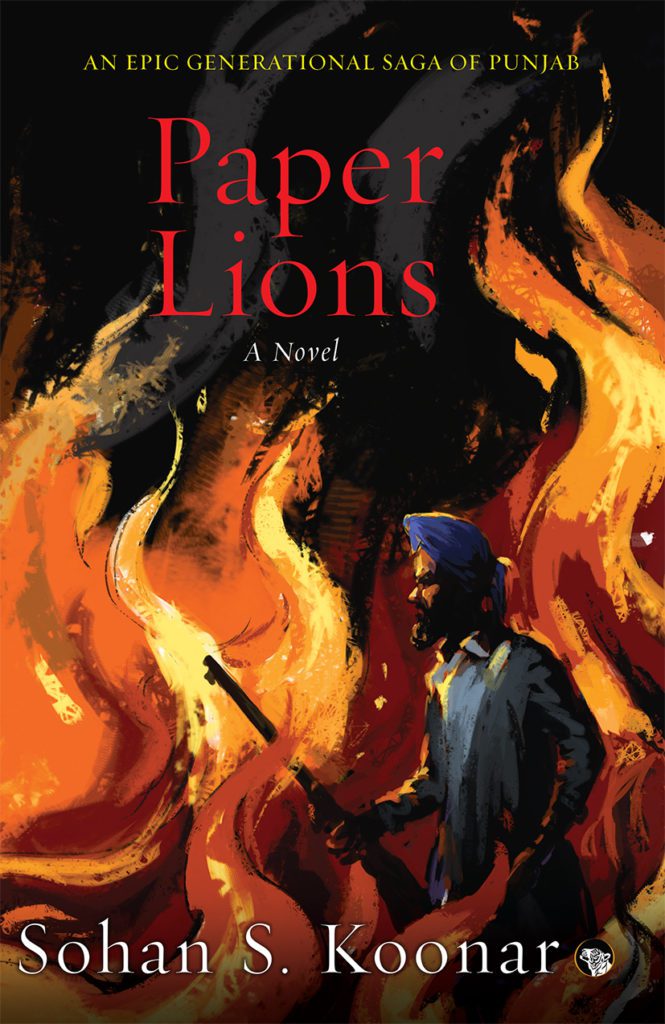
I assume that the cover design would be closely related to how the book is being pitched – Paper Lions has a mass-appeal cover, dramatic in nature, Drunk Bird Chronicles has a straightforward yet appealing cover, A Night with a Black Spider has a really minimalist, quotidian one.
Is that a correct assumption? How do you balance aesthetic, creativity, marketing and other factors that need to be considered?
Maithili Doshi: Yes the cover surely depends on how the book is pitched or what the vision for the book is. But I feel it’s always more to do with the book and what works for it. If the cover is true to the book and works for it, it will work for the sales too.
For example the cover of Drunk Bird Chronicles is quite straightforward in terms of the idea, but it is striking. Hence it even got featured on The Book Satchel.
The reason for such an approach is that the book and the story is quite layerd with a lot happening. So its best that the cover is simple as then it doesn’t create a visual clutter and overwhelm the viewer with information overload, but the way it’s treated and drawn creates enough intrigue.
On the other hand the cover for A Night with a Black Spider is very minimal. It is meant for certain readers who will have the appetite for a cover that’s cleaner and intriguing. But still the cover is not completely my whim. The visual is borrowed from the fact that there is a connecting theme of some kind of travel in the stories. If you see both the covers, though treated in completely different style, create enough curiosity about the book and I think that’s what the purpose of the cover design is – reveal just enough to draw the reader towards it.

As a designer it’s a balancing act and it’s up to you how much you give in. It’s not that there are no conflicts and there are times when you have to sacrifice your creative aspirations, but how much you do that is what you strive for. If you stick to the fact that you are creating something for the book and it is true to its essence, the struggle to balance and justify what you are doing is reduced. Because then it’s not about your personal aesthetics or choices. Then it doesn’t get into that subjective zone of what I like and what someone else likes. It’s not about I don’t like purple but more about why purple doesn’t work for the subject.
When you design something which is meant to be sold commercially, you have to look at your work a bit more objectively too.
Which genre of covers do you enjoy designing the most? Why?
Which cover has been the most difficult for you to design so far in your career? Why? Is there a book you wish you could one day make a book cover for?
Maithili Doshi: I don’t have any particular favourites when it comes to genres. I enjoy most of the genres, even in non-fiction and children’s categories, as long as it’s a good subject that I can relate to.
I cannot think of a cover that was very difficult but I overall find designing for mass-market, chick-lits very difficult. I just can’t get it. I really admire designers who can crack these. I am a very greedy designer and any book that comes out and I relate to, I wish I had worked on.
Do you have professional tips for aspiring book cover designers, especially in India?
Maithili Doshi: I think the younger designers are much more focused and know what they want to do. Which is great! The only thing is, while we follow new design trends and stay in tune with them, one should not get too carried away by those and stay true to our individual aesthetics and more importantly the content that you are designing for.
Could you give us an insight into a day in the life of a book cover designer?
Maithili Doshi: As a designer, a book designer could be scouting for illustrators, actually do the artwork themselves, or lay the page out among other things. It all depends on the nature of the cover. There are covers which demand a special kind of illustration which may not always be the designer’s strength. In those cases we collaborate with an expert in that particular style (like The Drunk Bird Chronicles, covers of books by Easterine Kire). Then there are covers like Kitchen Curse, Tram 83, The Other, Amba, A Night with the Black Spider where the artworks are created by me, as that’s my strength and style. Then there are covers which demand a photograph, where we look for a suitable photograph or photographer. There are books which demand the design for the inside pages, like children’s books. So as a cover designer it’s important that I look into that as well. You cannot separate the cover from the inside. So you oversee this big picture as an Art Director for a publishing house, and you could be doing multiple things at a time. You would be designing your covers, commissioning and art directing covers, coordinating with typesetters, providing insight.
*To illustrate how designers and publishers approach stories and covers differently, here are some covers of Kire’s other books, not published by Speaking Tiger. (Note: This is an editorial addition by the team at Purple Pencil Project and not an input Mathili Doshi. It is not meant to be a comparison in any way.)