


Charbak Dipta is a Senior Illustrator at Katha Books.
To start with, would you like to tell us a bit about yourself, your creative process and how you came to illustrations and book cover design as a career?
Charbak Dipta: I am a self-taught illustrator and graphic novelist. I always loved drawing and as a child got inspired by the works of Satyajit Ray, Bimal Das, Haren Das, Anup Roy, Mario Miranda among others as well as Indrajal comics, Tintin, Asterix and the American comics scene. Western European renaissance paintings too was a huge inspiration. In the case of illustrations, the visuals always fascinated me more than the text in books and magazines. So it is a no brainer I chose to be an artist.
Technically I prefer to work digitally as it allows you to operate most effectively with limited resources. Apart from that, if the text needs a manual touch, I also do hand sketches and colouring. But more than the technique, the idea is the most important aspect, that connects with the audience at the first sight.
Academically I did my masters in Philosophy and diploma in Film Studies from Jadavpur University and did a short course on modern art from Oxford University.
What do you think are the most important aspects of illustrating books as well as a book cover?

Charbak Dipta: A book cover has to be 2 things-
- One single page that will represent the whole book. It should be the concentrated display of the theme and the mood of the book. But again, it should not reveal the whole book as, then, there won’t be any point for the reader to sneak into the inner pages.
- Secondly, it should be flashy enough to attract the customer at one single glance.
In case of illustrations your job as the illustrator is to-
- Capture the mood of the text
- Choose the art style carefully that suits the best with it,
- Choose the moment in the narrative that is most dramatic and has visual elements in it to draw
- Understand the use of space to insert it without breaking the flow of the narration
Do not judge a book by its cover. To what extent do you think it felt true to you before you started illustrating and designing?
Charbak Dipta: I think even if the content of the book is dull, you have to advertise it on the cover as the most amazing thing in the world, that is the job of the cover designer. So, to some extent, it is true but that is the job of a designer. If the content is in level 1, you have to show it as level 10.
On the contrary, if a designer fails to elevate the greatness of a text then one should not judge the book by its cover. There are plenty of examples where the cover is mundane but the text grasps you.
So it can be said, the merit of the cover and inside texts run parallel, but where they match or the cover outruns the text, a designer wins there.
All the books are different, with different voices so before going for the first draft of an illustrator, what are your go-to inspirations for illustrating?
Charbak Dipta: I try to think like the author and indulge myself into his or her world. If I connect with the world or the style of writing, imagery instantly comes in my mine. It has to be instant or not. Too much brainstorming may make the cover complicated and the reader may fail to connect with that. It also applies to editorial and political cartooning.
What advice do you have for aspiring designers or illustrators? How important is it to understand the theme, genre and context, as an artist?
Charbak Dipta: The best way to learn designing book covers and illustrating is to see thousands of works, visit art galleries, read comics, grab the most attracting points in them, store them in your brain and improvise to use it wherever they suit. Copying works from great artists and observing things and people are also great ways of learning. Especially while copying from a work, many secret techniques unfold.
Again, watching films is important. Films teach you perspective and use of colours.
It is very important to understand the theme, genre and context and allow yourself to play with art styles. Your artistic skills have to be fluid like water to be in the shape of every container. You can not generally choose a grim style for a children’s book, use soft pastel colour for an adult book, use a folk madhubani art style in a book aimed for a western readership, but it depends.
Apart from illustrating and designing, what are the kinds of genres that you like digging in to read?
Charbak Dipta: I am a comic book geek. I binge European comics the most. Ligne-claire and Marcinelle school- I connect with them the most. Apart from that, I love reading long-form graphic novels by the likes of Will Eisner, Marjane Satrapi, Craig Thompson among others. American mainstream comics have so many things to learned from, like colouring, perspective and use of light.
I also enjoy editorial comics like the works of Bill Watterson, Chic Young, Dik Browne among others.
Could you share one book cover with us- from the draft to the final release and the changes it went through, what was changed and why
Charbak Dipta: My last published book from Katha is The Tale of Makkhilal. When I read the amazing story written by our founder Geeta Dharmarajan, many visuals instantly came in my mind. Generally, I do the cover at the end after illustrating the whole book. Thus cover can be made that represents the book more accurately. I made some 10 sample art styles for the book and at the end zeroes in on one style that you can see in the book. In between, we researched a lot and made subtle changes that speak of social and political values in the Indian context.
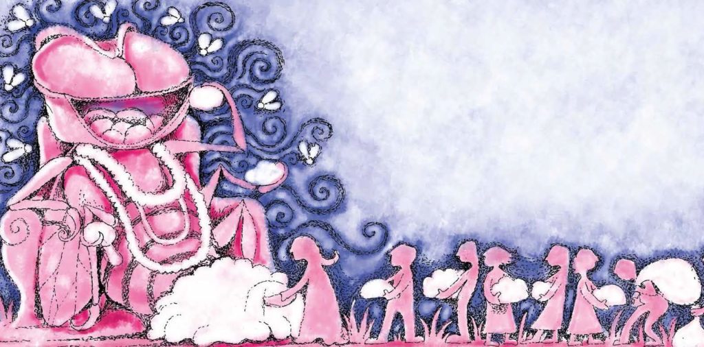
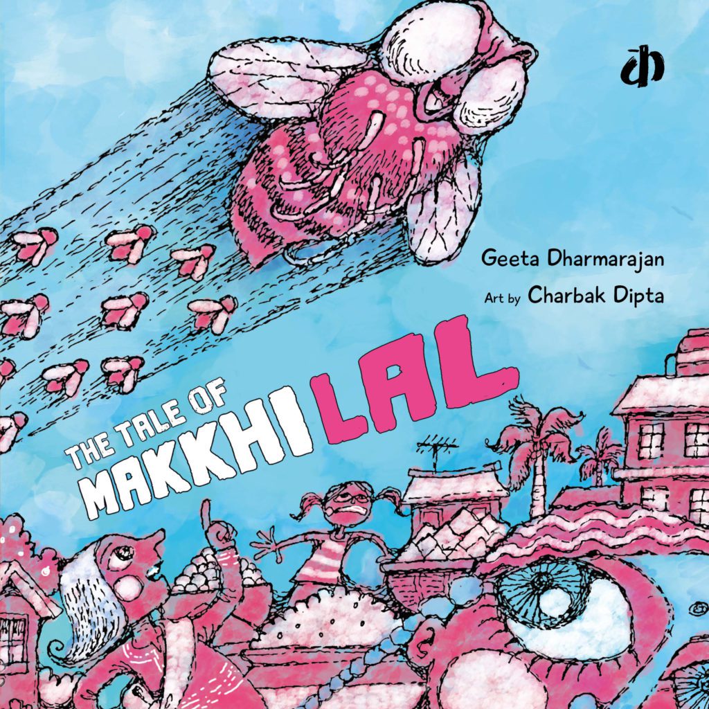
For the cover, I made 3 options again. The first one was a huge creepy fly head, breaking the fourth wall and staring directly to the reader. Later, I added more details to it but later cancelled it as it was too simple. Again I made two drafts. One was the villainous Makkhilal storming into the village along with its fly army and everyone is looking alarmed. The other was Makkhilal in the centre with the village around it in a flat 360-degree fashion. Later I chose the first draft to finalise for it looked better, more dramatic and gave a wholesome idea of the theme.